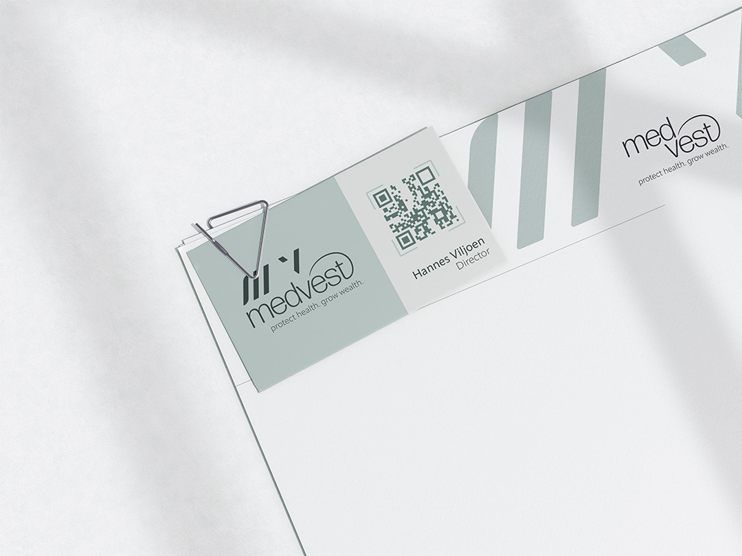
Medvest is an independent wealth management firm with a focus on building long-term relationships with its clients. The dream was realised while witnessing the unethical performance-based structure in the medical wealth sphere today. Medvest is a firm built on nobility and trust where medical specialists are empowered with knowledge to make their own informed investment decisions.
The icon consists of the letters ‘M’ and ‘V’. It is designed in a clean, modern and simplistic style to relate to the clinical environment of the target audience. The gap in the ‘V’ represents the gap that the brand fills within the market. The curve element has been added to the letter “t” as a comforting embrace to symbolise the relationships the brand builds with its clients and the care they have for them.
